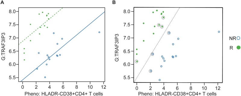
Fig 4. Best performing cross-assay pair using longitudinal samples.
(A) Regression model with the solid blue line indicating the estimated relationship between the two analytes for non-responders (NR) and the dotted green line the relationship for responders (R). (B) Support vector machine (SVM) with the dotted line indicating the best linear relationship separating the two groups. Observations that are circled are the “support vectors,” the observations that drive the placement of the line of separation. All observations are correctly classified by the SVM. G = gene expression; Pheno = CyTOF phenotyping.

