
Figure 3.
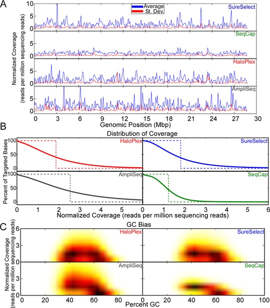
Assessment of sequencing depth in commonly targeted regions. A: Normalized coverage (reads per million sequencing fragments) (y‐axis) for all bases in commonly targeted regions. The average (blue) and standard deviation (red) for all genomic positions in commonly targeted regions are shown. B: Percentage of commonly targeted bases that had various minimum average coverage (solid lines). An “ideal” curve is plotted for each technology that assumes that all sequencing covers targeted bases uniformly. Because different technologies have different average normalized coverage (partially due to differences in capture size), ideal curves will differ between technologies. C: Normalized coverage was plotted against percent GC in 100‐bp windows for all mutually targeted bases for each technology. Darker colors and brighter colors indicate denser and lighter clusters of points, respectively.