
Figure 1.
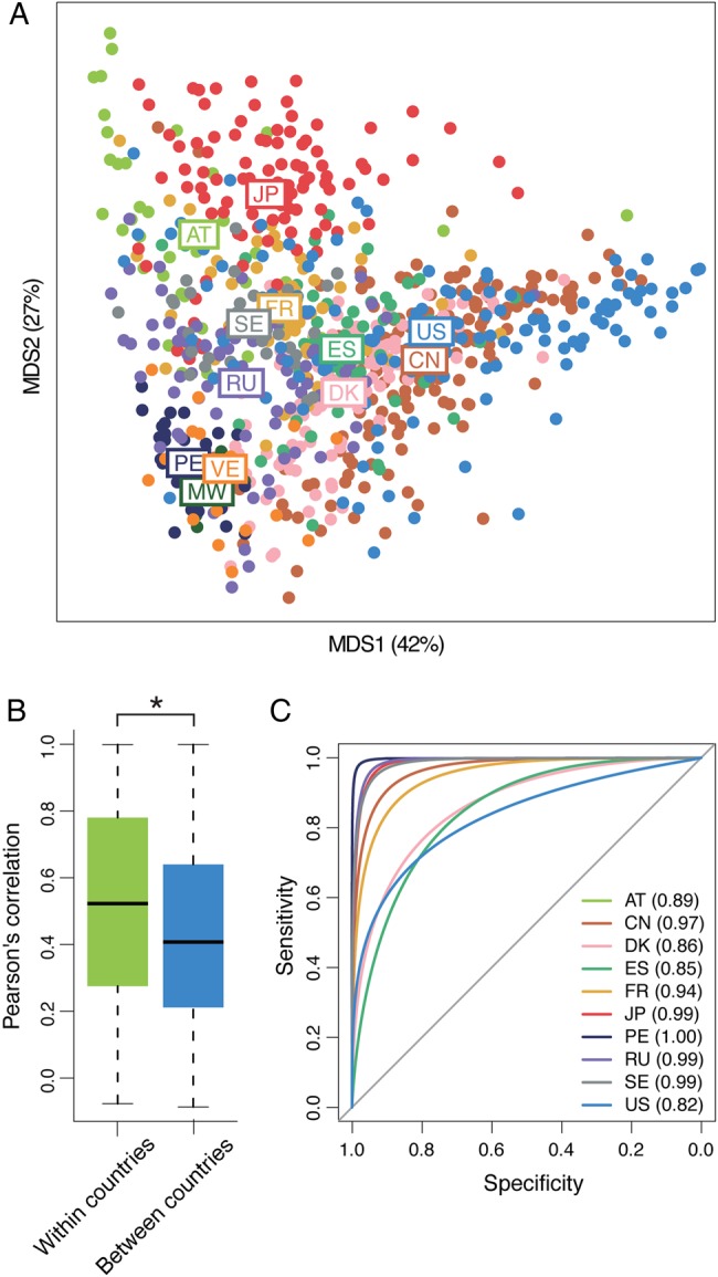
Population-level diversity in human gut microbiomes among the 12 countries. (A) The MDS plot of microbial compositions for all individuals. Each circle represents an individual microbial composition and each colour represents a country of origin. The position based on the average microbial composition for each country is displayed by the abbreviated country name. (B) Comparison of Pearson's correlation coefficients of microbial compositions in individuals within a country and between different countries. Boxes represent the inter-quartile range (IQR), and the lines inside show the median. Whiskers denote the lowest and highest values within 1.5 times the IQR. Asterisk represents P < 0.05. (C) ROC curves and AUC values from the randomForest model. Numbers in parentheses represent the AUC values of the 10 countries.