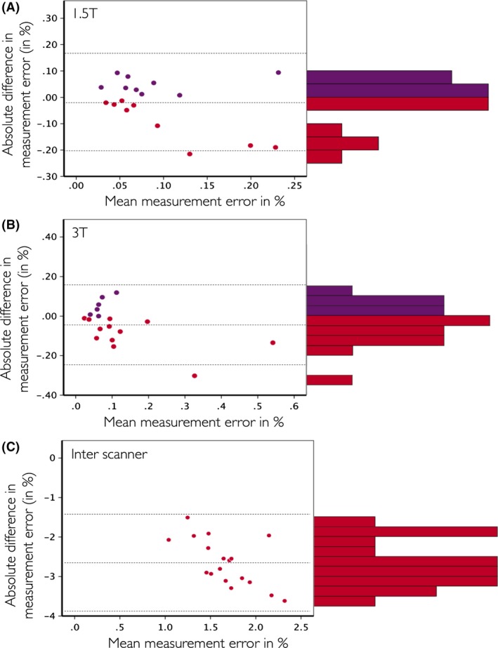
Figure 4.

Bland–Altman plots of the comparison MSmetrix versus SIENA on the same datasets for the 1.5T within scanner (A), 3T within scanner (B), and 1.5T versus 3T between scanner (C) comparisons. On the Y‐axis of all plots, the difference of the absolute value of the measurement errors is calculated as ‘MSmetrix – SIENA’, on the X‐axis of all plots the mean of MSmetrix and SIENA is displayed. Purple dots were used when ‘MSmetrix – SIENA’ is positive, red dots when this difference is negative. In addition, the histogram of the ‘MSmetrix – SIENA’ difference is shown on the right of each Bland–Altman plot.
