
Figure 3.
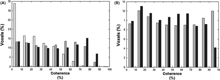
Coherence histograms of five analysis models. To evaluate the effectiveness of each model, the mean percent coherence per bins of 10% coherence was determined and presented in two histograms. (A) The histogram portrays the number of voxels explained by the three sine models. From left to right: global‐delay sine (white bars), voxel‐wise‐delay sine (gray bars), and frequency‐Adjusted sine (black bars). The global‐delay sine explains almost a factor of three more voxels with coherence below 10% and is decreasingly present in bins with higher coherence. Compared to the voxel‐wise sine, the frequency‐adjusted sine is only more present in the bins from 70% and higher. (B) The histogram portrays the number of voxels explained by the two “Optimal Signal” models divided in bins of 10% coherence. The unaffected hemisphere (gray bars) has a high number of voxels explained in the bins between 70 and 100%, whereas the sagittal sinus (black bars) explains more voxels in de lower bins.