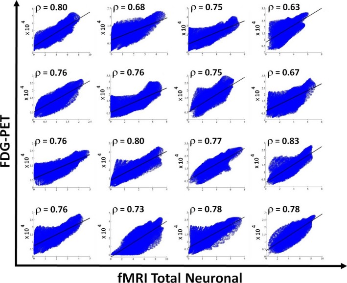
Figure 2.

Scatter plots for all the 16 healthy controls showing the correlation between the FDG‐PET after partial volume correction versus the fMRI‐total neuronal activity for voxels belonging to gray matter. Solid line indicates the best linear fit to the data and on the upper left corner of each scatter plot the linear correlation value is reported.
