
FIGURE 7.
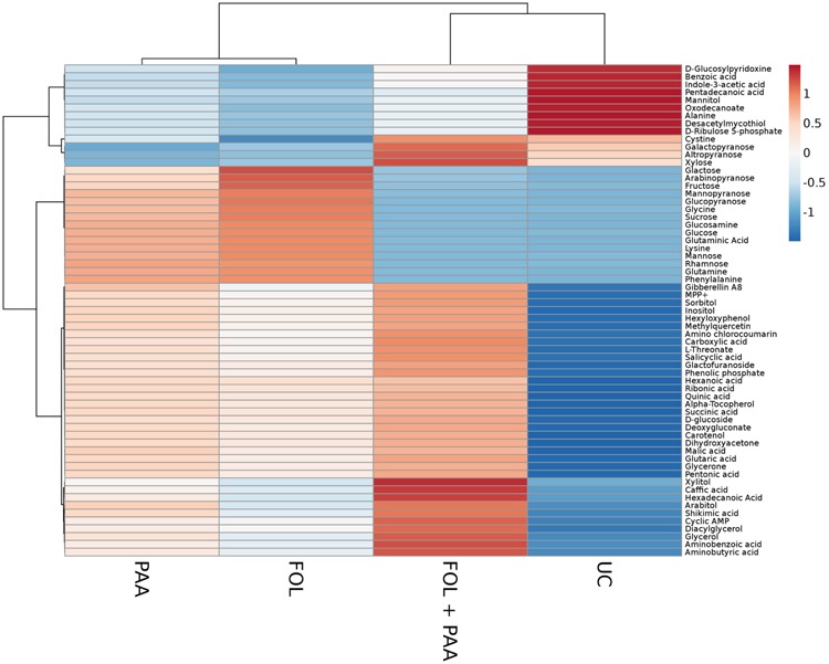
Heat map illustrating the different metabolite levels in tomato plants under different treatments. Each row represents differentially expressed metabolites while each column represents a treatment. Mean values of two independent experiments are presented here. Metabolites are clustered using average linkage hierarchical clustering. The colors in the heat map represent the intensity of the log2-fold change in metabolite levels. FOL, F. oxysporum f.sp. lycopersici. PAA, phenylacetic acid. UC, non-treated control.