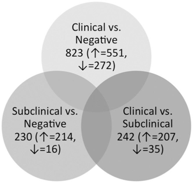
Fig 3. Venn diagram showing the comparison of differentially expressed genes between all group comparisons.

Venn diagram showing the number of DE genes in each group comparison as well as the numbers of genes that are up- (↑) or down-regulated (↓) in each dataset.
