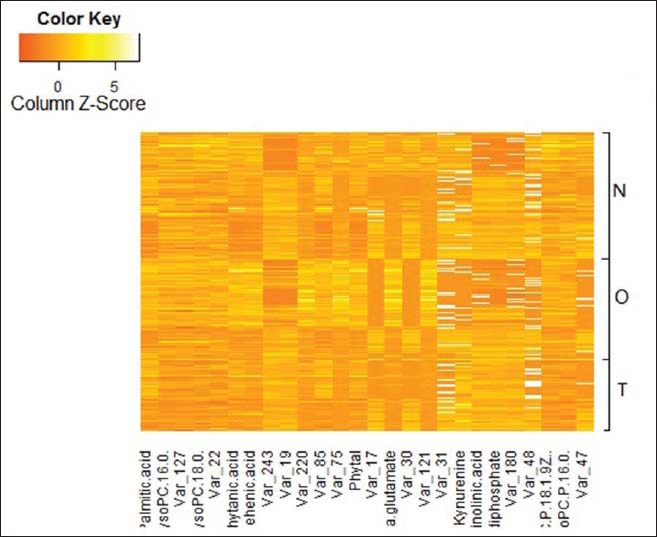
Figure 5.

Heat map based on the differences in the abundance of small metabolic compounds among sera from the tuberculosis (TB) group, healthy group and non-TB group. Yellow color indicates higher abundance of metabolites; Orange color indicates lower abundance of metabolites.
