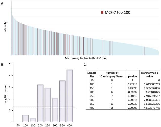
Fig 4. Integration preference with expression level.
A: rank order plot showing intensity of all microarray probes for MCF-7. Shown in red are the top 100 gene clusters targetted by FeLV insertion. B: Transformed p values of the significance of association between the top insertion target genes and the most highly expressed genes for different sample sizes. The dashed line represents p = 0.05 significance level. C: Table showing the p values represented in B for the different sample sizes.

