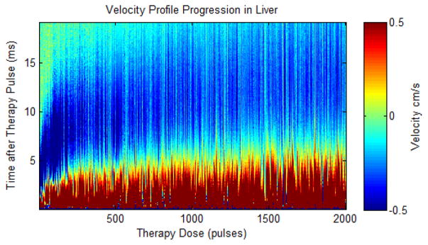
Fig. 17.
Plot showing the velocity estimates from Doppler after every therapy pulse in a single ex vivo porcine liver treatment. The plot shows velocity (color map) versus time after the therapy pulse (y-axis) over the course of therapy (x-axis). The estimated velocity is shown in color (red is away from the therapy transducer and blue is towards the therapy transducer) versus the delay from the therapy pulse (y axis) and therapy dose (x axis).

