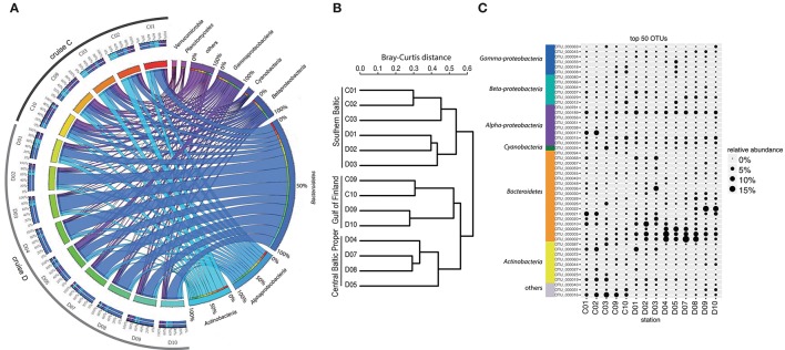
Figure 2.
Bacterial community composition and most abundant OTUs. (A) The figure displays relative OTU abundances grouped by bacteria phyla/classes in a circus graph. The right side of the graph visualizes relative OTU abundances of major bacteria phyla/classes summed over cruises C and D, as indicated by the size of the cells for each taxon (note color coding of ribbons connecting taxa with stations). Also shown are axes/cells for the taxon-normalized abundances at each station, as color-coded by station in the left side of the graph. Ribbons connect the relative abundances of the taxa with the color-coded stations on the left side of the graph, and width of ribbons is proportional to relative abundance. The left side of the graph indicates the relative abundances of the major taxa (color-coded according to taxa on right side of graph) at each sampled station during cruises C and D. Color-coding of stations (from red to blue-green) identifies proportions in inner circle/cells on right side of graph. (B) Beta-diversity analysis (beta-dendrogram, based on Bray–Curtis distance matrix), and (C) relative abundance patterns of the 50 most abundant OTUs across all stations. The group “others” in panel C comprises OTUs that have ≤92% sequence similarities to known sequences in NCBI (NCBI Resource Coordinators, 2013). Relative abundance is calculated as % of total sequences obtained per sample (excluding sequences annotated as chloroplasts).

