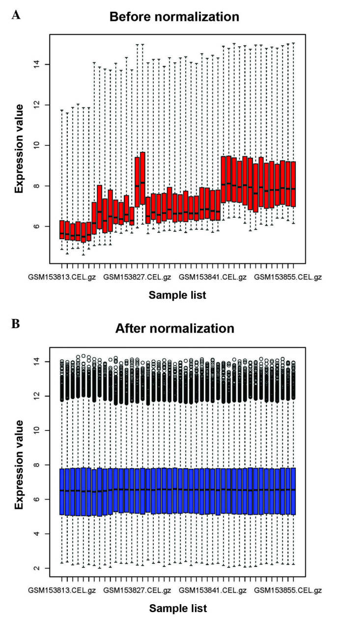
Figure 1.

Box plots of data (A) before (red) and (B) after (blue) normalization. The × axis represents the samples from the microarray data, while the y axis represents the gene expression values. The box plot refers to the interquartile range (25–75%), and the median is shown as a black horizontal line.
