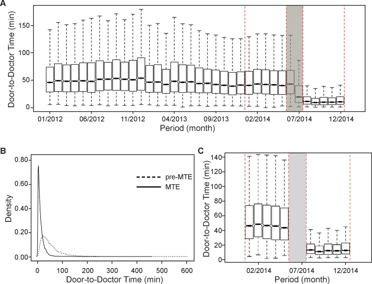
Fig 2. Door-to-doctor time in minutes before and after matching.
(A) The box plots indicate the median, the interquartile range (box) and the smallest and largest values that are not considered outliers (whiskers, 1.5 times the interquartile range from the first and third quartile, respectively) of the data before matching. Outliers are not shown. The red-dashed-lined rectangles represent the two periods of interest, i.e. pre-MTE and MTE. (B) Density plots of matched samples. (C) Box plots of matched samples.

