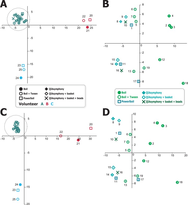
Fig 3. 2D plot resulting from principal component analysis.
A) Plot based on logarithm-converted values for the 25 samples. B) Plot based on the 19 samples from volunteer A enclosed by the dashed circle in panel A. C) Plot based on linear values for the 25 samples. D) Plot based on the 19 samples from volunteer A enclosed by the dashed circle in panel C. Horizontal and vertical axis represent PC1 and PC2, respectively. Sampling day numbers of volunteer A are shown as numerals.

