. 2016 Apr 21;5:e13053. doi: 10.7554/eLife.13053

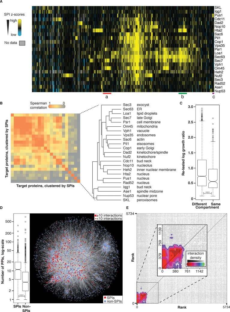
Figure 4. Comparisons of synthetic physical interaction screens.

(A) Cluster analysis of the SPI data. The 23 screens are arranged horizontally and the 727 GFP strains clustered vertically. High z-scores (positive; >2) in yellow and low (negative; < -1) scores in blue. Three distinct clusters are highlighted (a, b, and c) and described in Figure 4—figure supplement 6. (B) Spearman’s Rank Correlation Coefficients for the different SPI screens shows similar compartments give similar SPIs, for example, Sec63 and Loa1 cluster together as do two kinetochore proteins Nuf2 and Dad2. (C) The notched box-and-whisker plot indicates the distributions of the retest log growth ratios and indicates that SPIs produced by a query protein and a target protein from different compartments produce stronger growth defects than those from the same compartments (***indicates a p-value = 1.8x10⁻⁵, Wilcoxon's rank-sum). The plot shows the median value (bar) and quartiles (box), the whiskers show the minimum of the range or 1.5 interquartile ranges, outlying data points are indicated as circles and the notches indicate the 95% confidence intervals of the medians. (D) The GFP proteins with SPIs have, on average, more protein-protein interactions than non-SPI query proteins, the notched box-and-whisker plot is in the same format as panel B (***indicates a p-value <.2x10-16, Wilcoxon’s rank-sum). The 727 SPI query proteins (red) are superimposed upon the yeast interactome with proteins with ≥10 interactions shown as larger squares. (E) The CLIK interaction density plot for Sec63 is shown (see Figure 4—figure supplement 5 for the other CLIK plots). The ~500 Sec63 associations that show the strongest growth restriction have a high interaction density (inset).

DOI: http://dx.doi.org/10.7554/eLife.13053.013

Figure 4—source data 1. High-density retesting of the SPIs.
All the high-density SPI data to retest the strongest interactions are listed together with a list of those GFP strains that produce a reproducible SPI with each of the 23 GBP proteins. We also include a list of the growth data for a subset of GFP proteins whose expression and location is well characterized.
DOI: 10.7554/eLife.13053.014

Figure 4.

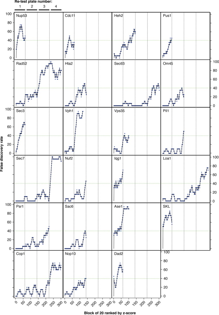
Figure 4—figure supplement 1. False discovery rates (FDR).

Figure 4—figure supplement 1.

Strains were ordered from highest to lowest z-score and the strongest 80 growth defects were retested with 16 replicates (80 strains with 16 controls per plate). The FDR was calculated for each batch of 20 strains working down the list of z-scores, shown here in blue. Black lines indicate three-point moving averages. Vertical dashed lines group points from each retest plate together. No more retests were performed once a screen had reached 40% FDR, indicated by a horizontal green dashed line.

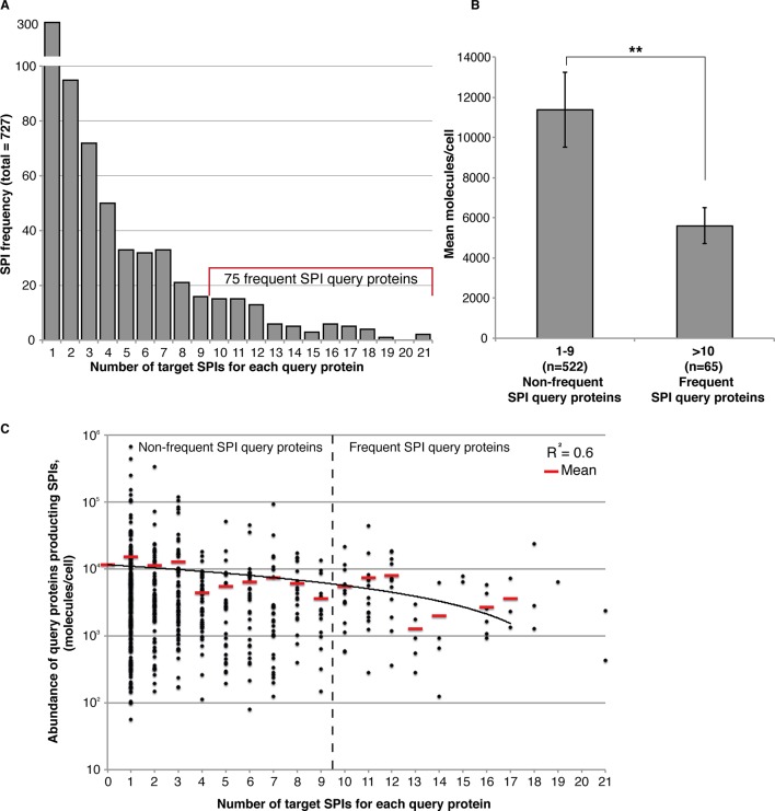
Figure 4—figure supplement 2. Frequent SPIs are with lower abundance query proteins.

Figure 4—figure supplement 2.

(A) The distribution of SPIs is shown as a bar chart illustrating that most SPI query proteins give a SPI with only one or a few target proteins. Nevertheless, 75 query proteins have SPIs with at least 10 target proteins, the ‘Frequent SPIs’. (B) Frequent SPI query proteins have a lower mean abundance than non-frequent SPI query proteins (t-test, p>0.006). Error bars indicate standard error of the mean. (C) Frequency data shown in (A) plotted in terms of protein abundance. The mean abundance values in each category are indicated as red lines a linear trendline is shown in black.

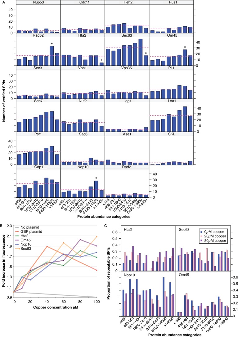
Figure 4—figure supplement 3. The effect of protein abundance on the number of verified SPIs.

Figure 4—figure supplement 3.

(A) The number of verified SPIs in each abundance category is shown for each screen, where abundance categories are bins containing an equal number (421) of proteins. The dashed line indicates the number of SPIs expected per category if distribution was entirely unbiased. (B) GBP-tagged protein levels were assessed via RFP fluorescence. Addition of copper to the medium increased the total protein concentration by as much as twofold. (C) 400 GFP strains were chosen to provide representatives in each protein abundance category, with a bias toward those in the highest abundance category. These GFP strains were retested with the four GBP-tagged proteins at different copper concentrations (0, 20, and 80 µM) and the proportion of SPIs within each category are indicated. Addition of copper did not increase the proportion of SPIs specifically with the high-abundance protein categories. It is of note that increasing the amount of Hta2-GBP produced more SPIs in all abundance categories, whereas increasing the amount of Nop10-GBP reduced the number of SPIs in all categories. Hence, although the amount of GBP protein can affect the SPIs, it does not correlate with GFP protein levels.

Figure 4—figure supplement 4. Frequent SPIs are rarely dominant.

Figure 4—figure supplement 4.

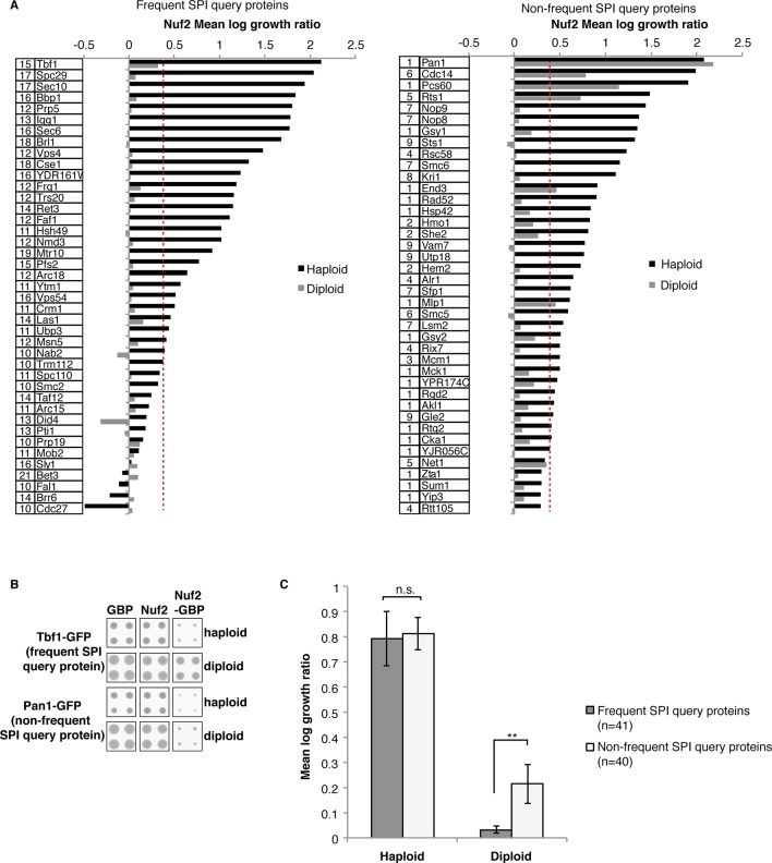
(A) From the Nuf2 SPI screen 41 frequent SPI query proteins (left panel) and 40 non-frequent SPI query proteins (right panel) were retested both as haploids and diploids. The numbers in the box to the left of the ORF name indicate the number of screens, out of 23, that the GFP-query protein was detected as a SPI. All the frequent SPI query proteins were not dominantly restricted for growth when associated Nuf2, compared with 15% (6/40) of the non-frequent SPI query proteins. (B) An example of the raw data with one frequent SPI (Nuf2-Tbf1) and one non-frequent SPI (Nuf2-Pan1) illustrate the suppression of the former SPI in diploid cells. (C) The mean log growth ratio of the combined 41 frequent and 40 non-frequent SPI query proteins from the Nuf2 SPI screen shows that there is no difference between frequent and non-frequent haploid SPI query proteins, in contrast the frequent diploid SPI query proteins are suppressed compared to non-frequent diploid SPI query proteins. Error bars indicate standard error of the mean, and **indicates a t-test p-value of 0.006; n.s. indicates not statistically significant.

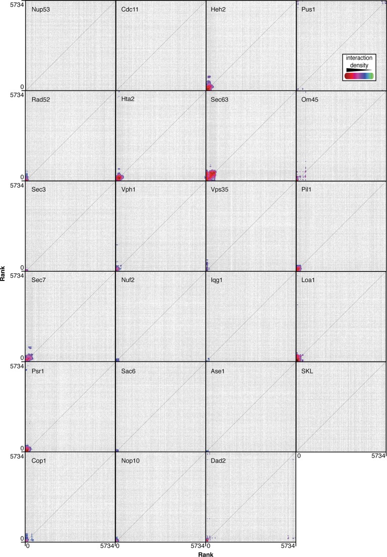
Figure 4—figure supplement 5. CLIK (Cutoff Linked to Interaction Knowledge) outputs for each of the 23 screens.

Figure 4—figure supplement 5.

Strains are ranked according to z-score and plotted in this order along the x- and y- axes (at position 0 is the strain with the strongest growth defect). Points are plotted where a genetic or physical interaction exists between two strains, and colors indicate high density of interactions.

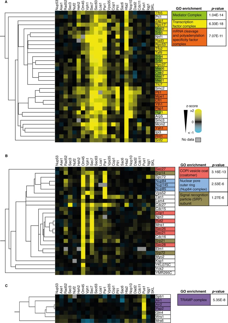
Figure 4—figure supplement 6. Analysis of three sub-clusters from the 727 SPI heat-map from Figure 3A.

Figure 4—figure supplement 6.

(A) Many components of the mediator complex, transcription factor complex, and mRNA cleavage and polyadenylation specificity factor complex cluster together the SPI data (cluster a in Figure 4A). (B) Almost all components of the COP1 vesicle coat (or coatomer), nuclear pore outer ring (specifically the NUP84 complex), and signal recognition particle (SRP) subunits cluster together (cluster b in Figure 4A). (C) Members of the TRAMP complex cluster together and are specifically SPIs with the target protein Pus1 (cluster c in Figure 4A). p-Values for gene ontology (GO) term enrichments are indicated.