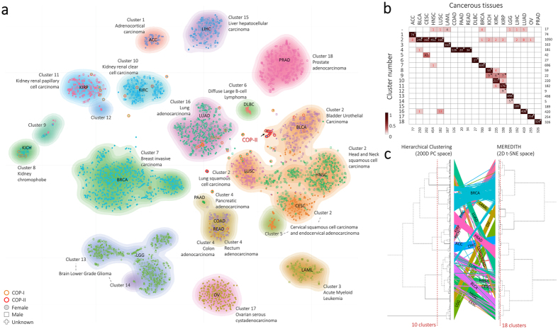
Figure 2. Patient-sample projection in a two-dimensional map illustrating the cancer-landscape.
(a) Projection of the 4,434 patient cancer samples using MEREDITH. Each point, either being square (male), dot (female), or plus (gender unlabeled), is a sample which is colored based on the cancer-type label (19 cancer-types in total). The clustering of cancer samples is illustrated by the 18 differently colored density maps. (b) Heat map depicting the clustering of cancer samples versus cancer-types. A star indicates significant overrepresentation of samples from a specific cancer-type in a cluster, whereas the colored squares depict the percentages of cancer samples in a particular cluster. Red colored number depicts the COP samples. (c) A comparison of hierarchical clustered samples using the 200PC space versus MEREDITH and hierarchical clustering. An edge links the sample ID positions as clustered by the HC and t-SNE approaches. Edge colors are based on the cancer-tissue labels.

