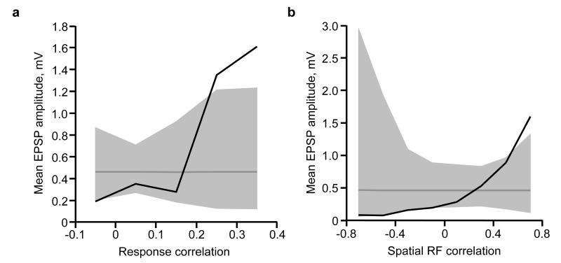
Extended Data Figure 2. Relationship between mean connection amplitude and response correlation or RF correlation.
a, Black trace, mean connection amplitude (excluding unconnected pairs) plotted against response correlation. Dashed grey line indicates mean EPSP amplitude of all connections. Grey shaded region represents the 95% confidence interval of the expected mean, estimated by repeated random reshuffling of the EPSP amplitudes among all cell pairs in the data set. Connections were binned with ranges from −0.1 to 0, 0 to 0.1, and so on. b, Black trace, mean connection amplitude (excluding unconnected pairs) plotted against RF correlation. Dashed grey line indicates mean EPSP amplitude of all connections. Grey shaded region represents the 95% confidence interval of the expected mean, estimated by repeated random reshuffling of the EPSP amplitudes among all cell pairs in the data set. Connections were binned with ranges from −0.8 to −0.6, −0.6 to −0.4, and so on.

