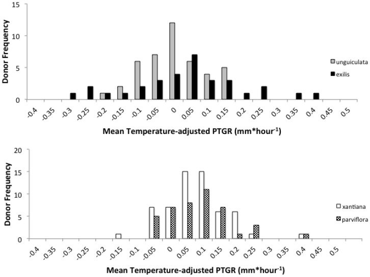
Figure 3.
Frequency distribution showing mean temperature-adjusted PTGR for unguiculata (grey) and exilis (black) pollen donors (upper panel) and xantiana (white) and parviflora (checkered) pollen donors (lower panel). Each bar corresponds to the number of pollen donors whose mean PTGR fell within the range indicated on the X-axis.

