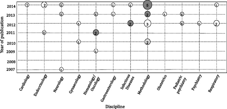
Fig. 3.

Bubble plot of indirect methods using individual patient data by year of publication and discipline. The size of each bubble is proportional to the number of studies published in the corresponding year and discipline. Light grey bubbles represent publications using the matching adjusted indirect comparison (MAIC) and simulated treatment comparison (STC) methods, white bubbles represent publications using an individual patient data network meta-analysis (IPD-NMA) method, and dark grey bubbles represent publications using both IPD-NMAs and MAIC/STC methods
