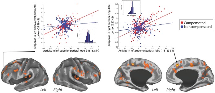
Figure 6.
Positive PPI between the left SPL (seed) and the response regions left DLPFC and right ACC for compensated trials versus no-step slow trials in a representative individual. The compensated trials are in red, and the noncompensated trials are in blue. The plots represent the regression of the time series of the seed region (left SPL) on the time series of the responding region. The lines illustrate the regression (red line, compensated trials; blue line, noncompensated trials). The dots are the observed data (residual values) adjusted for main effects (red dots, compensated trials; blue dots, noncompensated trials). The dots are residual fMRI time series data (activation factored out) for every single time point in the recorded fMRI time series. For each participant, the slope of line plotting residual activity in the seed against residual activity in the response region was calculated for compensated and noncompensated trials. The difference in the slopes is plotted in the histograms presented in the inset. Positive values represent larger slopes for compensated than noncompensated trials. This was done in order to visualize the data across subjects.

