
Figure 3.
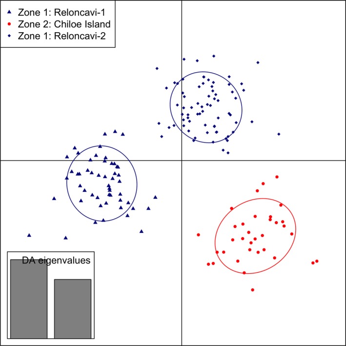
Clusters obtained by discriminant analysis of principal component in scenario 2 data (34 putatively outlier SNPs and five locations). Clusters are shown by different colors and inertia ellipses, while dots, triangles, and rhombs represent individuals.