Figure 3.
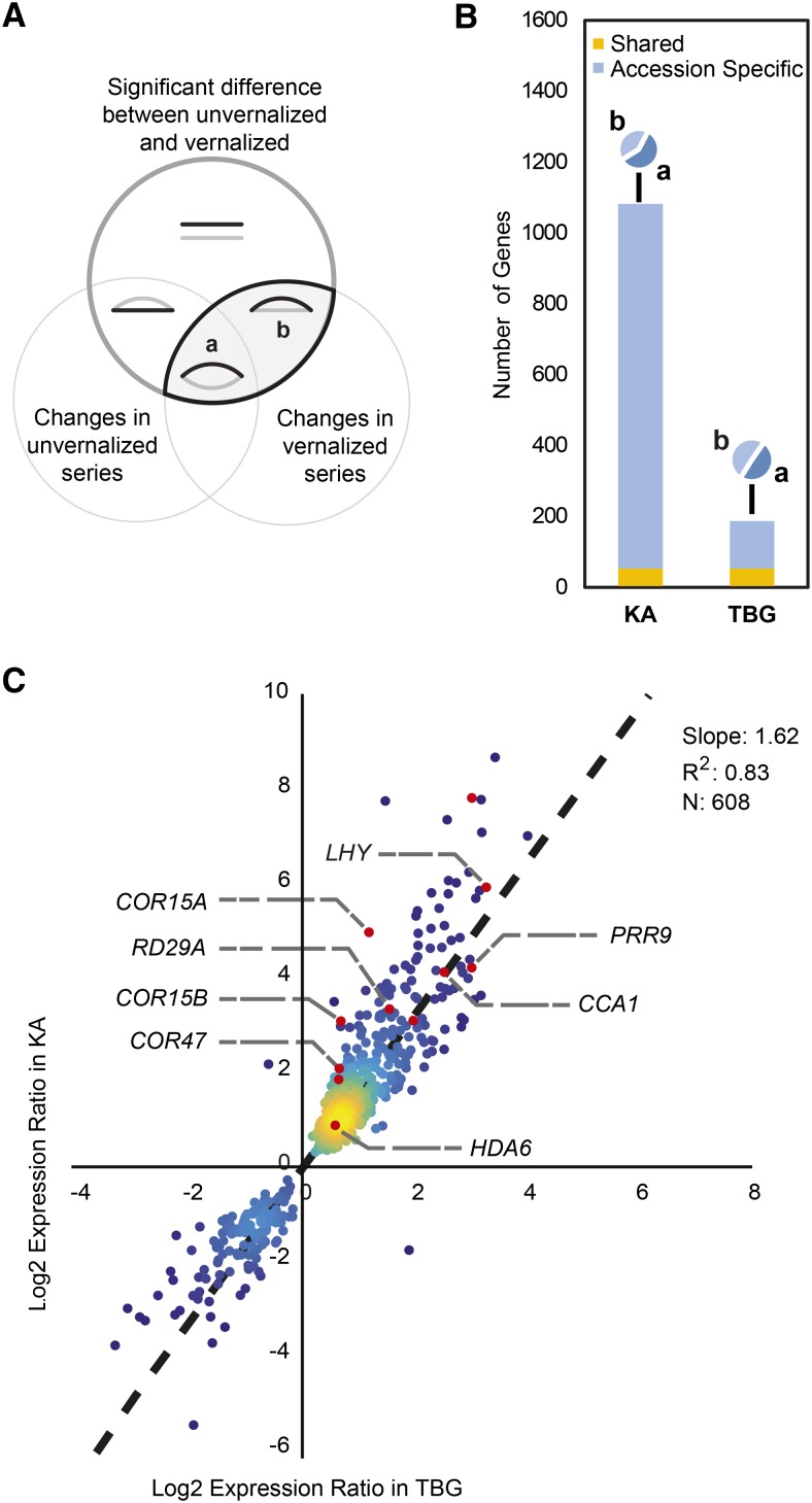
Vernalization response differences between KA and TBG mainly due to a reduced magnitude of response in TBG. A, Venn diagram representing the seven categories of differential responses for each accession. The top circle (dark gray) includes genes with significant differential expression when comparing the vernalized and unvernalized time series. The bottom left circle contains genes with significant differential expression among time points in the unvernalized time series. The bottom right circle contains genes with significantly different expression among time points in the vernalized time series. Cartoon curves show schematic vernalized (black) and unvernalized (gray) expression profiles of genes found in each category. Vernalization-responsive genes are found for each accession at the intersection between the top and bottom right circles. Within this pattern, a represents genes that change across the time series in both vernalized and unvernalized plants, but in distinct ways, while b includes genes that show changes in the vernalized time series but not in the unvernalized time series. B, Decomposition of each vernalization response showing which genes change in both accessions (yellow), which are accession specific (blue), and how they are partitioned between a- and b-category patterns (camembert diagrams). Almost 6 times more genes are identified as vernalization responsive in KA compared with TBG. C, Comparison of vernalization responsiveness in KA versus TBG. The responsiveness of a gene is calculated for each accession as the log2 ratio of vernalized over nonvernalized expression levels. Only ratios significantly different from 1 (log2 ratios different from 0) in both accessions are displayed. Several genes discussed here are highlighted. Colors signify plot density. The dotted line indicates the linear regression fit line based on n = 608 data points. The slope and r2 values for the fit are given on the chart.

