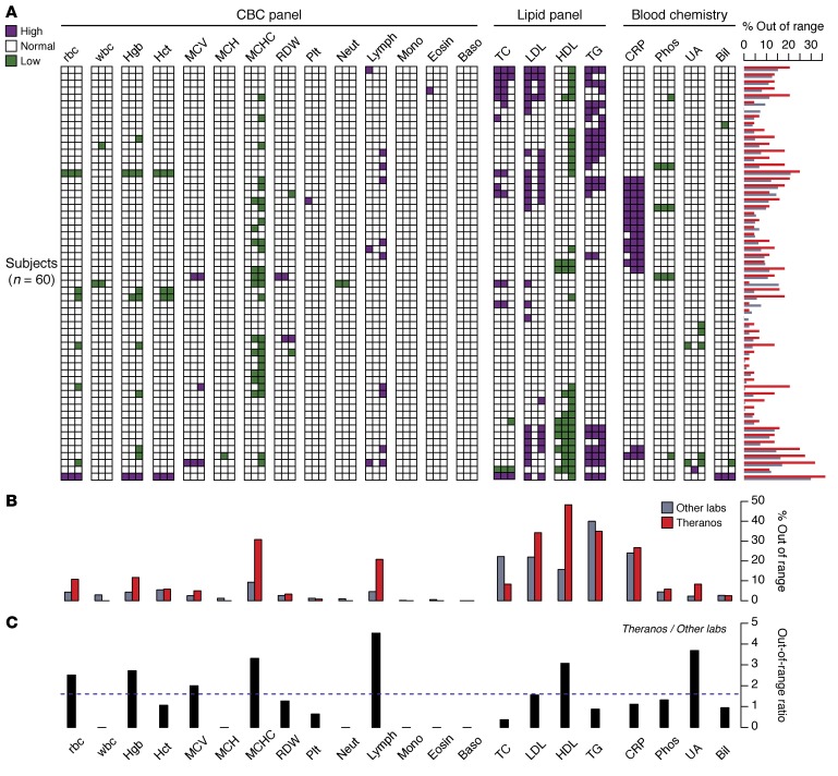
Figure 2. Lab test values reported outside of their reference range.
(A) Panel of test results displayed as a 2-dimensional heatmap. Each row represents one of the 60 subjects, and the columns aggregate the multiple measurements collected for each subject and testing service (6 measurement for Labs 1 and 2; 2 measurements for Theranos) (Lab 1, LabCorp; Lab 2, Quest Diagnostics). The column for each lab test is ordered from left to right by LabCorp, Quest, and Theranos. Colored squares indicate if at least one measurement is outside the normal range high (purple) or low (green). The horizontal bar chart alongside the rows of the heatmap reflects the percent of measurements outside the normal range at the individual level. All percentages represent 100× the number of measurements outside the normal range divided by the total number of measurements collected. (B) Comparison between percentage of tests outside the normal range across all subjects and multiple measurements for Theranos and the other labs (average of LabCorp and Quest). (C) Ratio of the tests outside their normal range — Theranos versus the mean value of LabCorp and Quest. Dashed horizontal line reflects a ratio of 1.6, which is the odds ratio for out-of-range tests between Theranos and the other labs. LDL ranges evaluated using normal LDL-C ranges and individual LDL-C measures reported directly by each provider. All comparisons made using reference ranges provided by individual testing services. Directly measured LDL values were used for Theranos.

