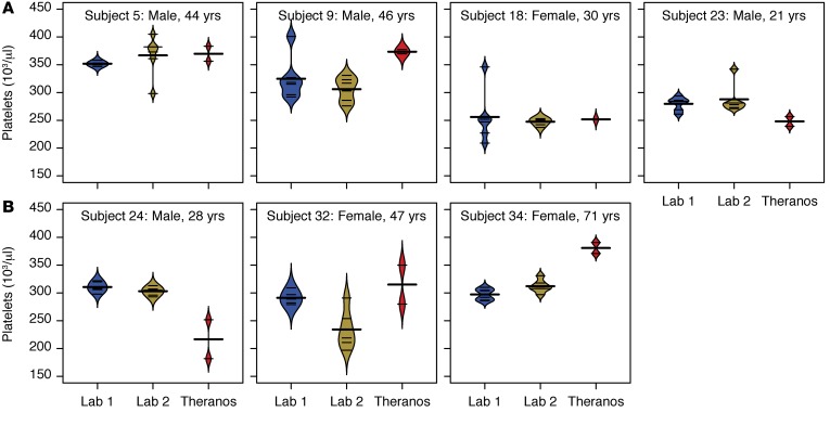
Figure 7. Variability in platelet counts.
Bean plots show the distribution across multiple measurements for each of the services (6 for Labs 1 and 2 versus 2 for Theranos) (Lab 1, LabCorp; Lab 2, Quest Diagnostics). Thin horizontal lines represent values from each sample for an individual, and the thick horizontal lines reflect the mean platelet count for a given testing service. (A) Subjects with large intraservice variability in platelet counts. (B) Subjects with large interservice variability in platelet counts.

