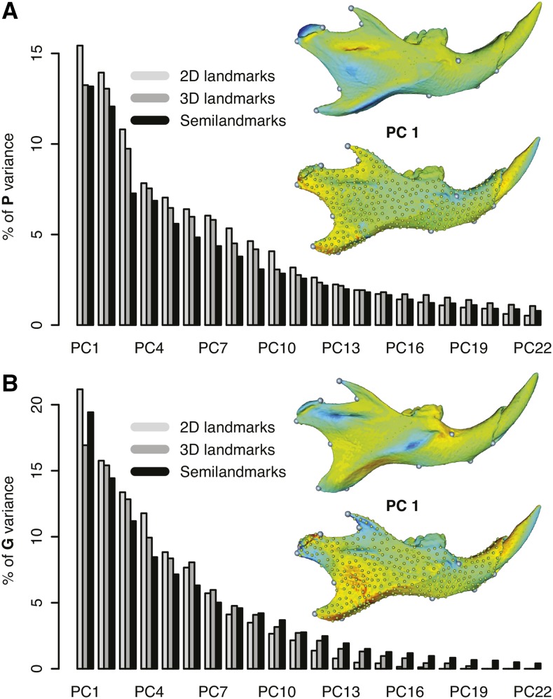
Figure 2.
Principal component (PC) analyses of mandible shape variation. (A) Percentage of variance explained by the first 22 PCs from phenotypic covariance matrices together with the visualization of shape changes associated with PC 1 from 3D landmark and semilandmark datasets. In the visualization, darker colors (red or blue) represent interpolated shape changes diverging from the mean shape. Green color represents unchanged shape of the mandible compared to the mean shape. (B) Percentage of variance explained by the first 22 PCs from G matrices based on discovered QTL (quantitative trait loci).

