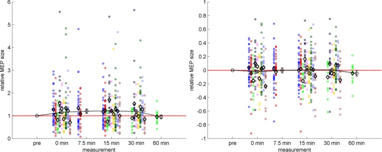
Fig 4. PAS-induced effects.

Mean MEP amplitudes following PAS are shown relative to the baseline level. Each study is represented by a distinct color as in Figs 2 and 3, each circle represents the measurements of one subject, and each black diamond marker represents the mean of a study at the given time-point. The black line with error bars represents the temporal course of PAS across subjects and studies. The dashed red line represents no change against the baseline measurement. Left panel: normalized data ± SEM. Right panel: same PAS data but log-transformed prior to calculation of means and SEM. Note that the x-axis depicts distinct time points rather than a continuous scale.
