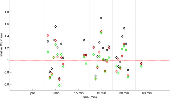
Fig 5. Comparison of methods to calculate the average PAS response.

Each column of diamond markers represents the different averages of one study: the mean (black), the median (red), and the mean as calculated on the log-transformed data that was back-transformed to linear space (green). The mean values are systematically higher than those of the median or those of the mean calculated on the log-transformed data.
