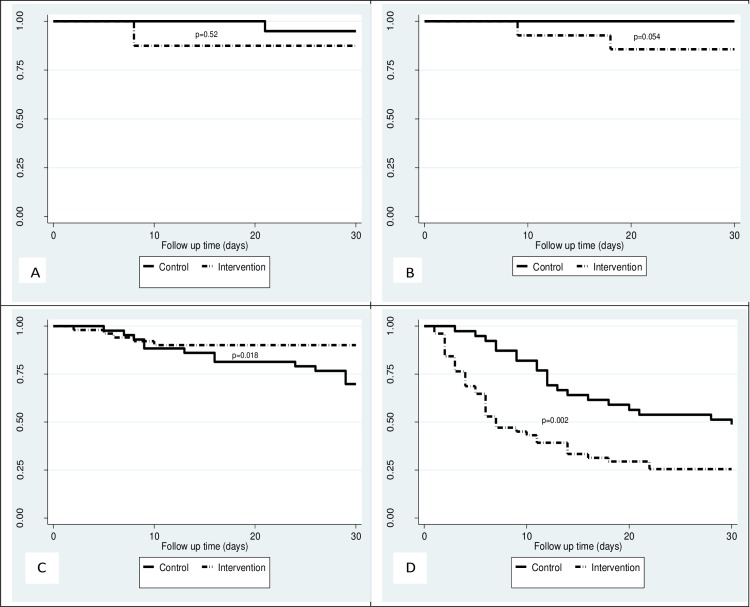
Fig 3. Kaplan Meier survival curves by stroke severity category comparing survival of patients in the control group and the intervention group.
(A) shows Kaplan Meier curves comparing survival of participants with mild stroke in the control and intervention groups. (B) shows Kaplan Meier curves comparing survival of participants with moderate stroke in the control and intervention groups. (C) shows Kaplan Meier curves comparing survival of participants with severe stroke in the control and intervention groups. (D) shows Kaplan Meier curves comparing survival of participants with very severe stroke in the control and intervention groups. The p values were obtained from the log rank tests.

