
Figure 3.
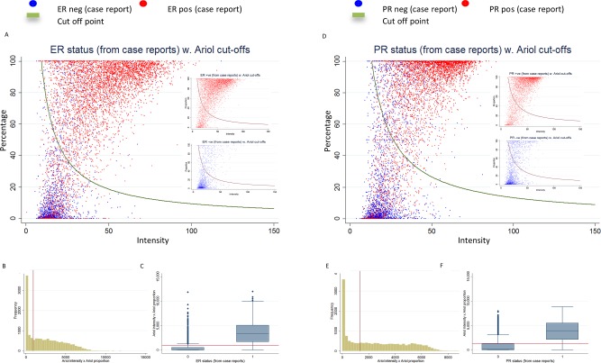
Distribution of ER (A–C) and PR (D–F) continuous automated scores (subject level) and positive/negative status in BCAC database, including 6424 cases for ER and 6385 cases for PR from nine studies. (A) Scatter plot of the intensity and percentage automated scores colour coded according to the BCAC ER status (red for positive and blue for negative). The red curve represents the cut‐off point for positive/negative status by the ROC method. The smaller inserted plots show ER‐positive and ER‐negative cases separately (B) Distribution of intensity*percent automated scores. (C) Boxplot of the intensity*percent automated score by BCAC ER status. Red lines show the positive/negative cut‐off points for the corresponding automated score. Figures D–F show similar plots for PR.