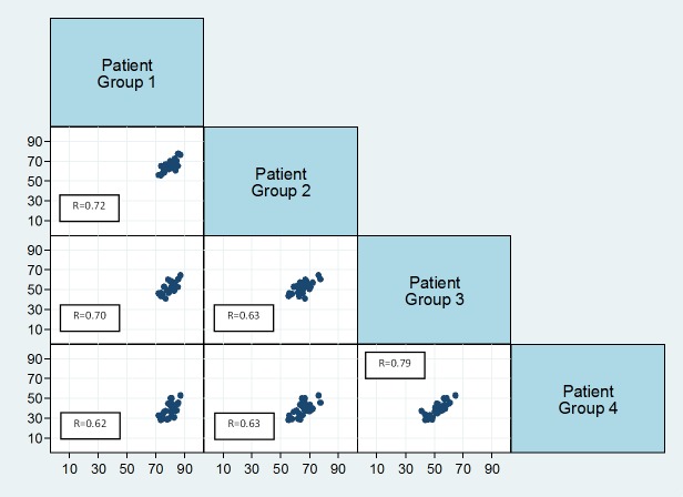
Fig 3. Correlation matrix showing correlation between the proportions of women with a breast in each patient group across the Cancer Networks.
The x-axis represents the group at the top of the plot, and the y-axis the group on the right. The linear association between patient groups is described by the correlation coefficients.

