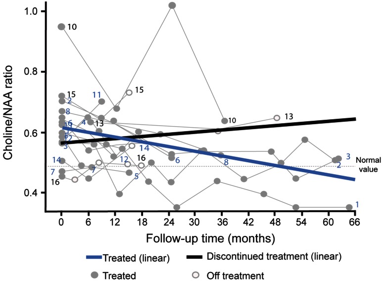
Fig. 2.
Progression of Cho/NAA ratios over time. Zero time point represents the start of follow-up period; thick coloured lines represent average prediction based on linear mixed modelling analysis, and thinner grey lines represent individual patient profiles. Dashed horizontal line represents normal values based on values from healthy controls (Personal Communication, D Galanaud, 2014)

