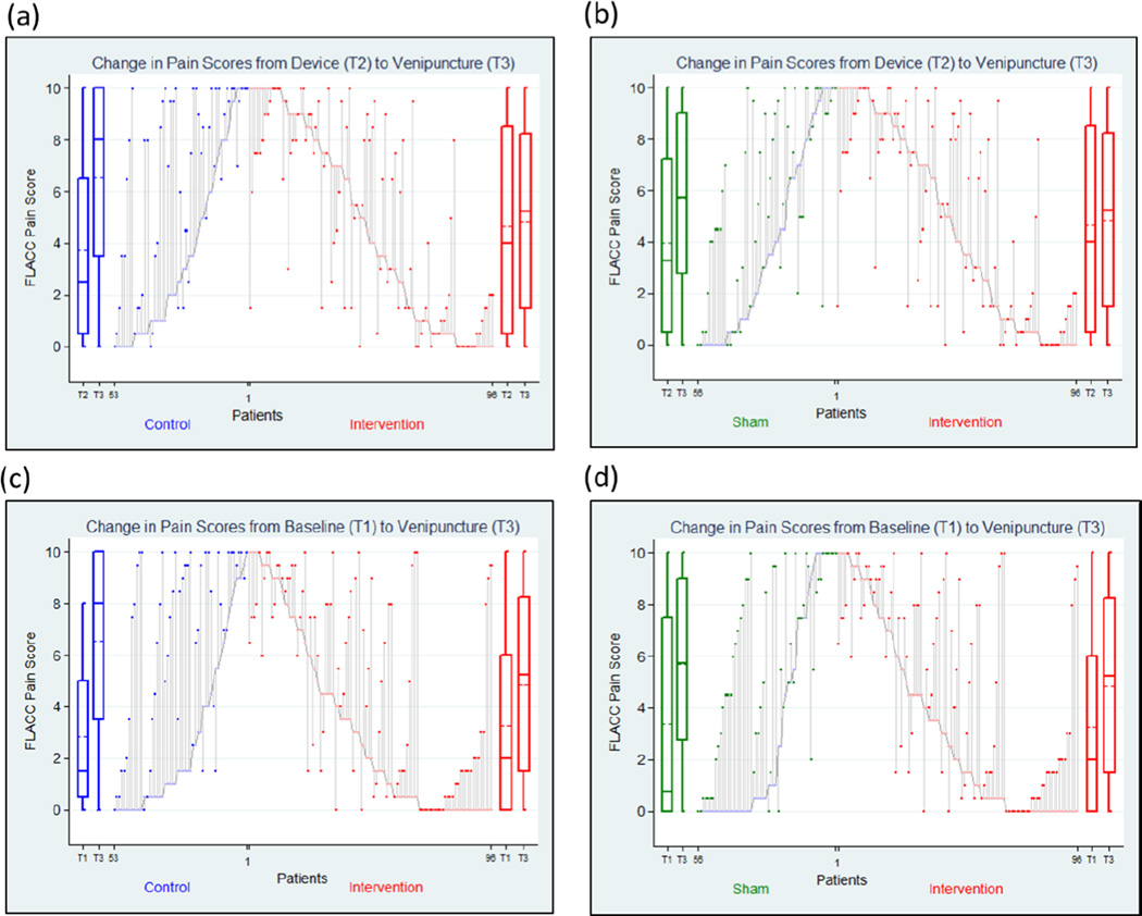
Figure 5. Changes in FLACC pain scores for individual patients.
Parallel lines represent changes in FLACC pain score and changes in FLACC pain score from Device (T2) to Venipuncture (T3) compared between Intervention and (a) Control and (b) Sham and from Baseline (T1) to Venipuncture (T3) compared between Intervention and (c) Control and (d) Sham. The boxplots on the sides represent FLACC pain scores. The solid horizontal lines represent median, the dashed line represents mean, boxes represent interquartile range and whiskers represent range.

