FIGURE 3.

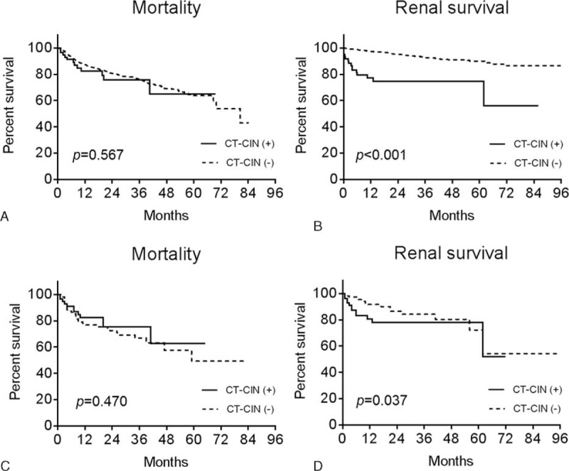
Kaplan-Meier survival curves of mortality (A, C) and renal survival (B, D) before (A, B) and after (C, D) propensity score matching. The X-axis shows the duration from the CT scan by month, and the Y-axis shows the percent survival.

Kaplan-Meier survival curves of mortality (A, C) and renal survival (B, D) before (A, B) and after (C, D) propensity score matching. The X-axis shows the duration from the CT scan by month, and the Y-axis shows the percent survival.