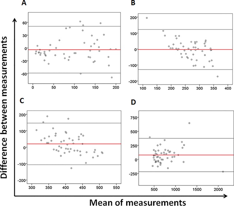
Fig 3. Bland-Altman analysis.
Bland-Altman plots of (A) CD4 T-cells < 200/mm3, (B) between 200 and 350/mm3, (C) between 350 and 500/mm3, and (D) above 500/mm3 according the CD4 cell count levels. For each plot, the x-axis represents the average of CD4 count between the PIMA and the BD FACSCountTM, and the y-axis represents the bias (difference) between the PIMATM Alere and the BD FACSCountTM. The solid red line represents the mean of the difference between the two measurements, and the light black lines represent the upper and lower limits of agreement (ULA: mean differences plus and 1,96 x standard deviation of the mean difference; LLA: mean differences minus and 1,96 x standard deviation of the mean difference)

