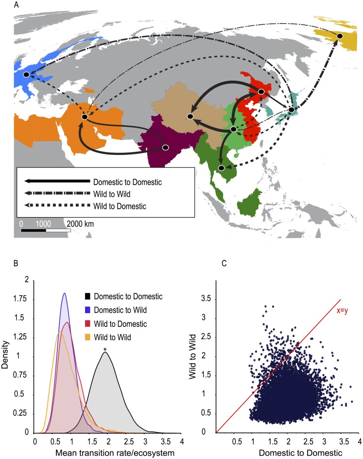
Fig 3. Inferred migration rates and patterns.
(A) Map showing statistically supported transitions between geographic regions by ecosystem. Line thickness corresponds to viral flow rates shown in Table 2 (thinnest<0.5; ≥0.5<1; ≥1<2;≥ 2 thickest). (B) Density distribution of statistically supported mean transition rates between ecosystems. *Domestic-to-domestic rates are significantly faster than domestic-to-wild (BF>100), wild-to-domestic (BF = 62.3), and wild-to-wild (BF = 39.4). (C) Statistically supported mean migration rates per MCMC step of wild-to-wild avian transitions versus domestic-to-domestic avian transitions.

