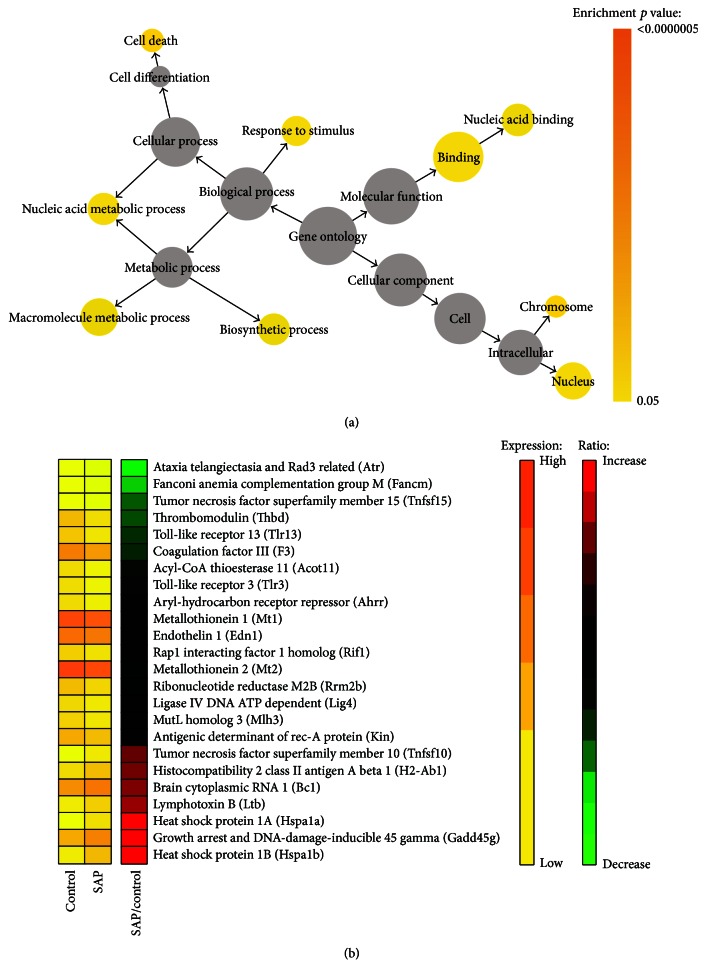
Figure 2.
Functional clustering analysis of differentially expressed genes. (a) Differentially expressed genes were analyzed using BiNGO software. Significantly enriched GOslim categories were highlighted with different colors representing different levels of significance. The size of each circle is correlated to the number of genes. (b) Heat map of the 24 differentially expressed genes that fall into the response to stimulus category. In the heat map, the first and second columns correspond to the absolute gene expression levels (FPKM values) of SAP and control group, respectively. Values are color-coded, with yellow representing low levels and orange representing high levels. The third column of the heat map reports the relative expression levels. The values are the log2 ratio of SAP versus control. Red indicates increase and green indicates decrease.

