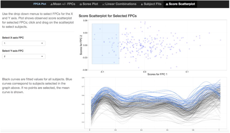
Figure 1.

Screenshot showing tab 5 of the interactive graphics for FPCA. A scatterplot of FPC loadings ĉik against ĉik′ is shown in the upper plot, and k and k′ are selected using drop-down menus at the left. The lower plot shows fitted curves for all subjects. In the scatterplot, a subset of estimated loadings can be selected by clicking-and-dragging to create a blue box; blue curves in the plot of fitted values correspond to selected points in upper plot.
