
Figure 1.
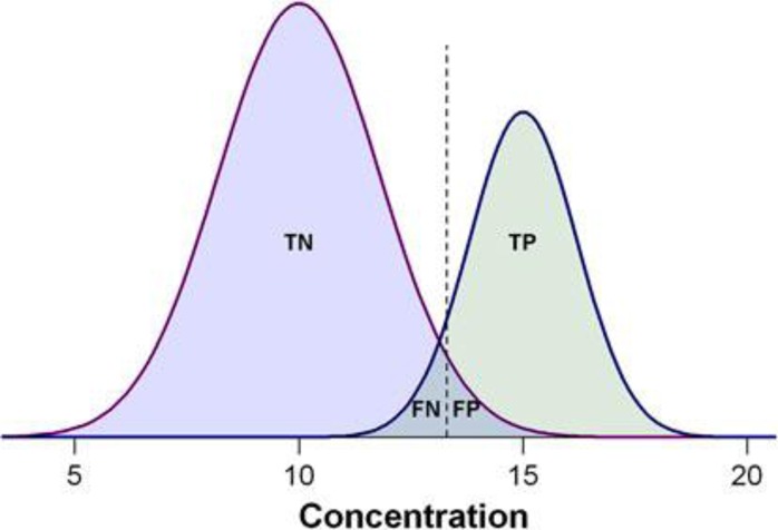
Demonstration of the biomarker prediction test with two Gaussian curves indicating the distributions of measured values, with positive cases on the right side and negative cases on the left. The dashed lines indicate the cutoff threshold of hypothetical biomarker concentration that can be used to separate positive from negative tests. The overlap between the biomarker concentrations of the two populations represents the misclassification ratio between the left-hand side of the positive cases and the right-hand side of the negative cases. TP, the number of true positives; TN, the number of true negatives; FP, the number of false positives; FN, the number of false negatives, respectively.23