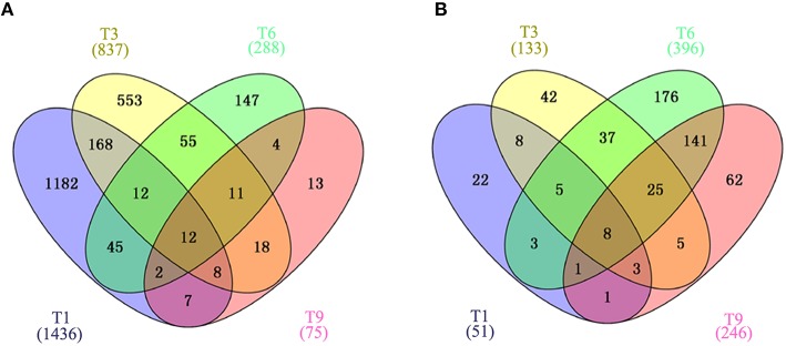
Figure 3.
Venn diagram showing the overlap of DEGs clustered into four comparison groups (T1, T3, T6, and T9) represented by four ellipses. Numbers outside the ecllipses correspond to groups unique to a given infection stage. Numbers in the overlapping parts of different ellipses correspond to the number of DEGs in common from those comparison groups. (A) Veen diagram of identified DEGs in T. gondii. (B) Veen diagram of identified DEGs in PK-15 cells. Numbers in parentheses indicate the total number of DEGs in each data set.

