
Figure 5.
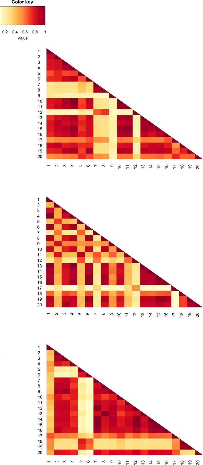
Colorized matrices of Bray–Curtis similarity between studies and between year groups based on their reported pitfall trap designs (from top to bottom: 1994, 2004, 2014). Each research paper was treated as a “site”, while the design variables (e.g., trap diameter, killing preservative used) were treated as “species”; the value of each variable (e.g., the trap diameter in mm) represented “abundance”. Each colored box is the similarity between two studies on the basis of their pitfall trap designs, with darker colors indicating more similarity. The apparent increase in similarity in the 2014 year group is likely due to the higher incidence of “NS” in the data. The key interpretation point for these figures is that if methodological variation was zero (and reporting complete) between researchers, the figure would be of a uniform color.