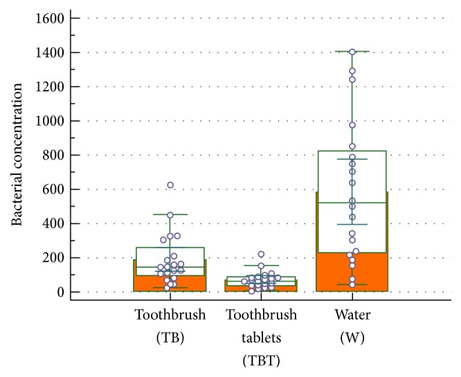
Figure 2.

Box plot comparison between TB, TBT, and W. The graphical representation box and whiskers plot shown above, using the multiple comparison mode, is used to describe the distribution of a sample by means of simple measures of dispersion and location. The central box represents the values from the lower to upper quartile (25 to 75 percentile). The middle line represents the median. A line extends from the minimum to the maximum value, excluding “outside” and “far out” values which are displayed as separated points.
