
Figure 2. Representative example of a whole slide prostate biopsy specimens with 30% cancer.
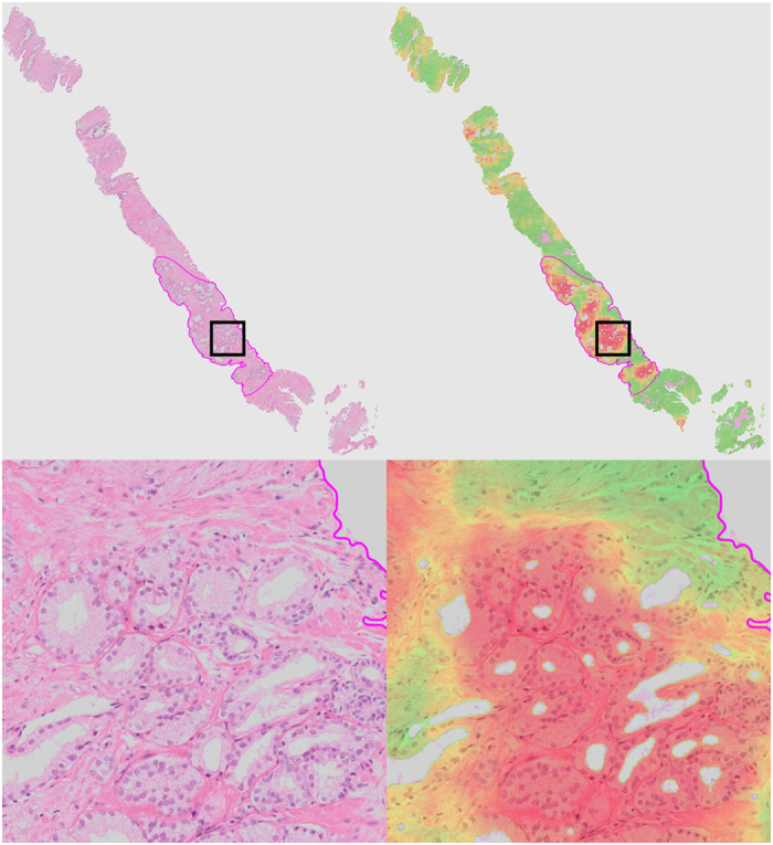
The top row shows the complete field of view, the bottom row a close up (close-up area indicated by the square rectangle). The second column shows the cancer likelihood map as an overlay on the original image. Red indicates a high likelihood of cancer, whereas transparent/green indicates a low likelihood.