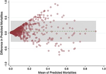
Fig. 5.

The Bland-Altman plot shows the difference between the University Health Consortium (UHC) and Mortality Probability Model III (MPM-III) plotted against the average predicted mortalities. The green horizontal dashed line represents the overall mean of the differences, while the shaded area shows the limits of agreement
