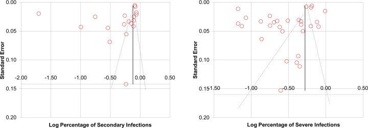
Fig 5. Funnel plot of the percentages of severe infections against standard error and funnel plot of the percentages of secondary infection against standard error.
The percentages of severe infections are displayed on a logarithmic scale. The shapes of both the funnel plots revealed obvious asymmetry.

