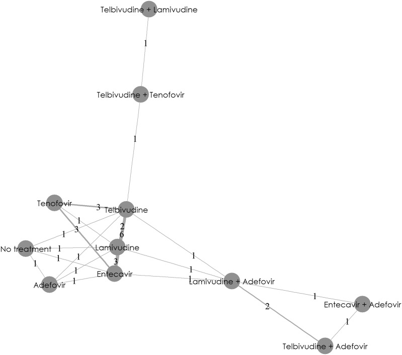
Fig. 4.
eGFR changes from baseline at 1 year: network diagram. This network diagram provides a graphical summary of direct and indirect evidence available from trials. A node represents each treatment option. Lines connecting two nodes represent the direct evidence comparing the treatments. The numbers between the lines represent the number of studies available for that particular treatment comparison. eGFR estimated glomerular filtration rate

