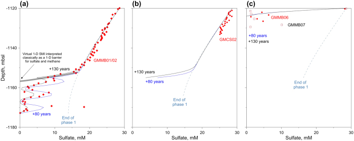
Figure 6. Sulfate profiles: model versus data.
Comparison between model results (blue lines) and the measured sulfate concentrations (red diamonds and black squares) at 3 selected sites. Blue dash-dot lines correspond to the end of phase 1, while the blue dashed and continuous lines correspond respectively to 80 and 130 years after the lateral advection of methane.

