Fig. 2.

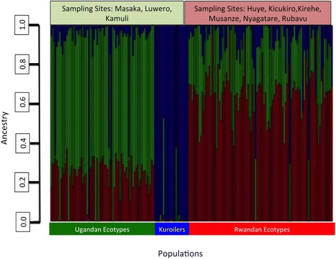
Admixture plot showing mixed ancestry between populations and individuals. Green denotes Ugandan ecotypes, red denotes Rwandan ecotypes, blue denotes Kuroilers. Based on optimal k = 3

Admixture plot showing mixed ancestry between populations and individuals. Green denotes Ugandan ecotypes, red denotes Rwandan ecotypes, blue denotes Kuroilers. Based on optimal k = 3