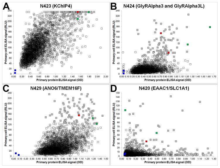
Figure 1. Representative ELISA primary screen data.
Scatter plots show the relative distribution of ELISA data from NeuroMab projects N423 (A), N424 (B), N429 (C) and N420 (D), where protein and cell ELISA data are plotted on the x- and y-axis, respectively. Each project began with 2,944 hybridoma-containing wells and each graph shows 2,948 data points (squares) that together comprise positive (green) and negative (blue) control wells (each the average of 32 replicates), unselected wells (unfilled squares) and selected wells (grey squares), with red squares denoting the wells with candidates that ultimately became NeuroMabs.

