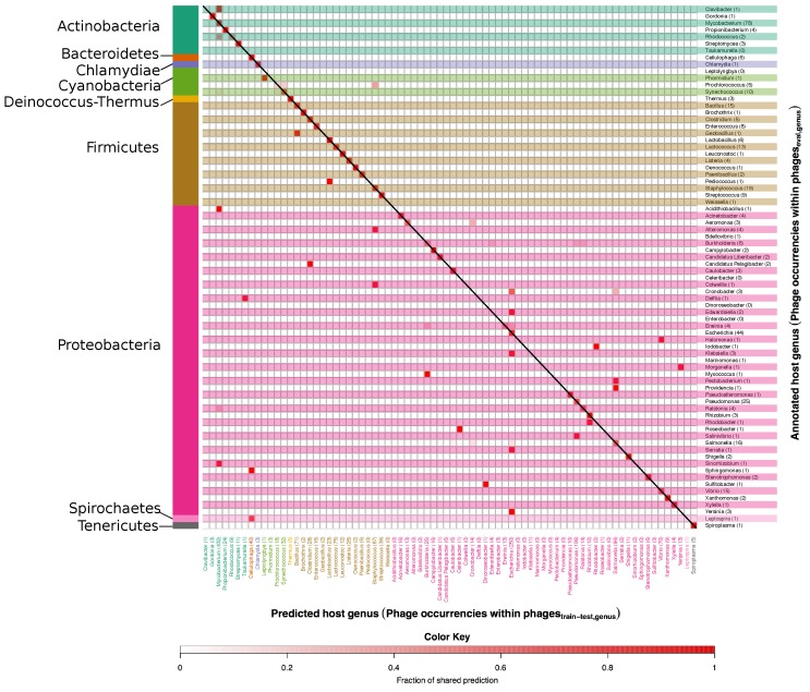
Figure 7.
Heatmap of annotated vs. predicted host genera in the set. In this figure correct as well as mispredicted host genera can be seen. Annotated host genera are listed along the y axis, while predicted ones are on the x axis. The number after each genus on the y axis and the x axis indicate the number of occurrences of phages in the and respectively. Host genera are grouped according to the respective phylum, which are indicated on the left side of the figure. The colour scale indicates the fraction of phages predicted as targeting a particular host and goes from white, no phages, to intense red, 100% of the phages. Accordingly, the colour is in itself not an indicator of correctness of the prediction, and red colours along the diagonal represent correct predictions.

